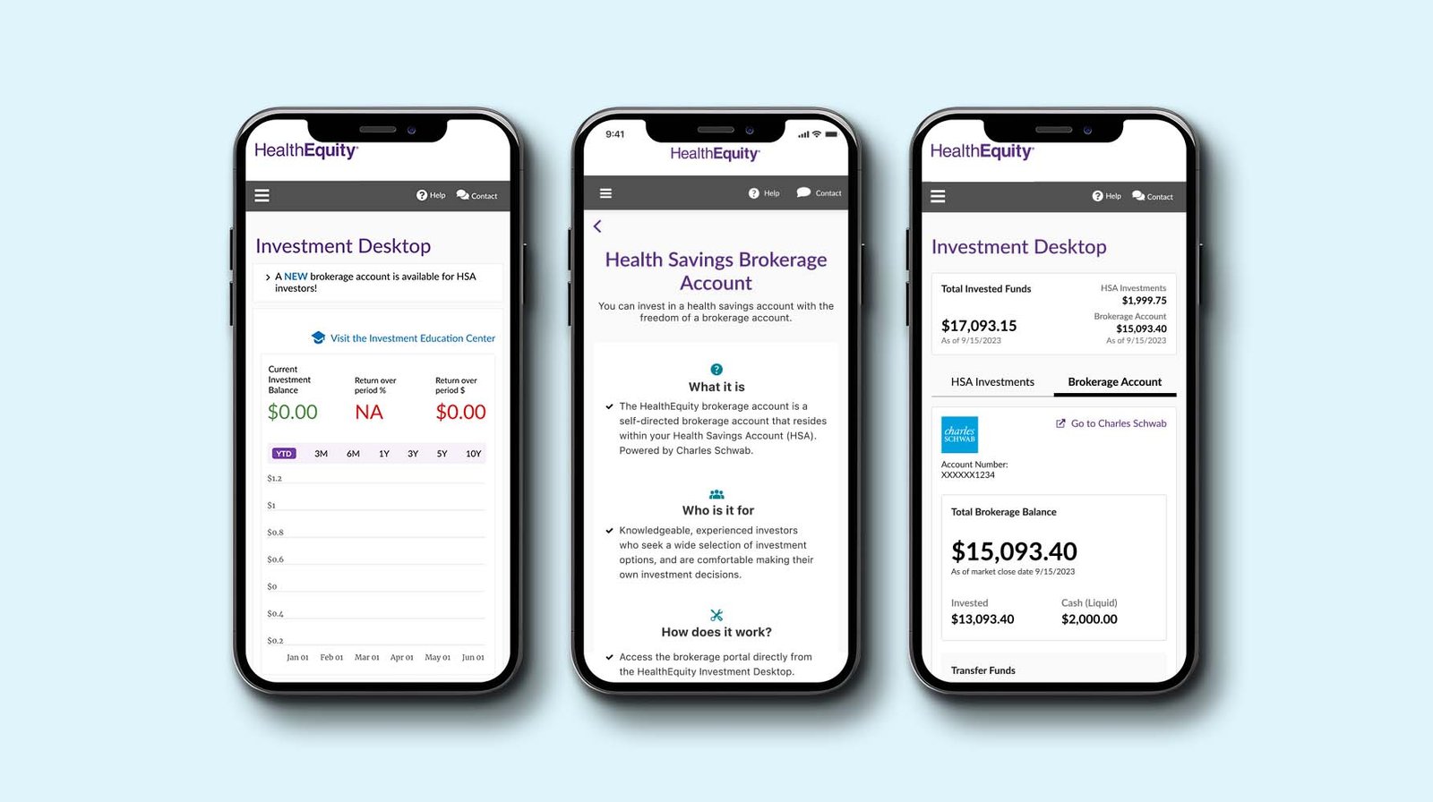
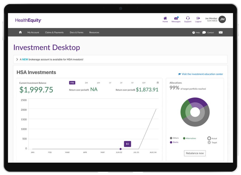
HealthEquity partnered with Charles Schwab to introduce a Health Savings Brokerage Account (HSBA) option for HSA investors. This new feature enabled members to manage brokerage investments directly through the Investment Desktop, expanding their portfolio choices while maintaining platform consistency.
The Challenge
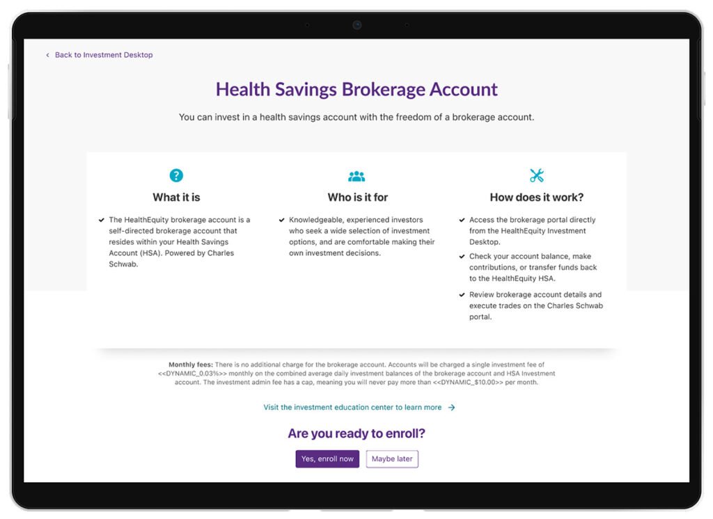
The brokerage feature represented a strategic enhancement to HealthEquity’s investment tools; however, with a unique constraint: HealthEquity does not financially benefit from HSBA accounts, the offer had to be introduced subtly without overshadowing the core investment products.
This required careful UX decision-making to:
Maintain trust and transparency with users
Avoid disrupting existing investment journeys
Deliver seamless access to brokerage management tools
Goals
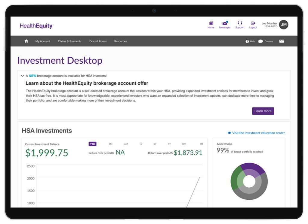
Subtly introduce HSBA to eligible users within the Investment Desktop
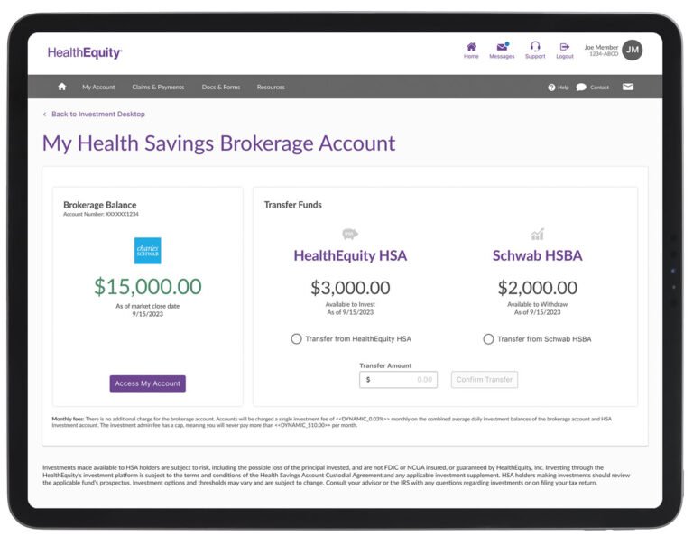
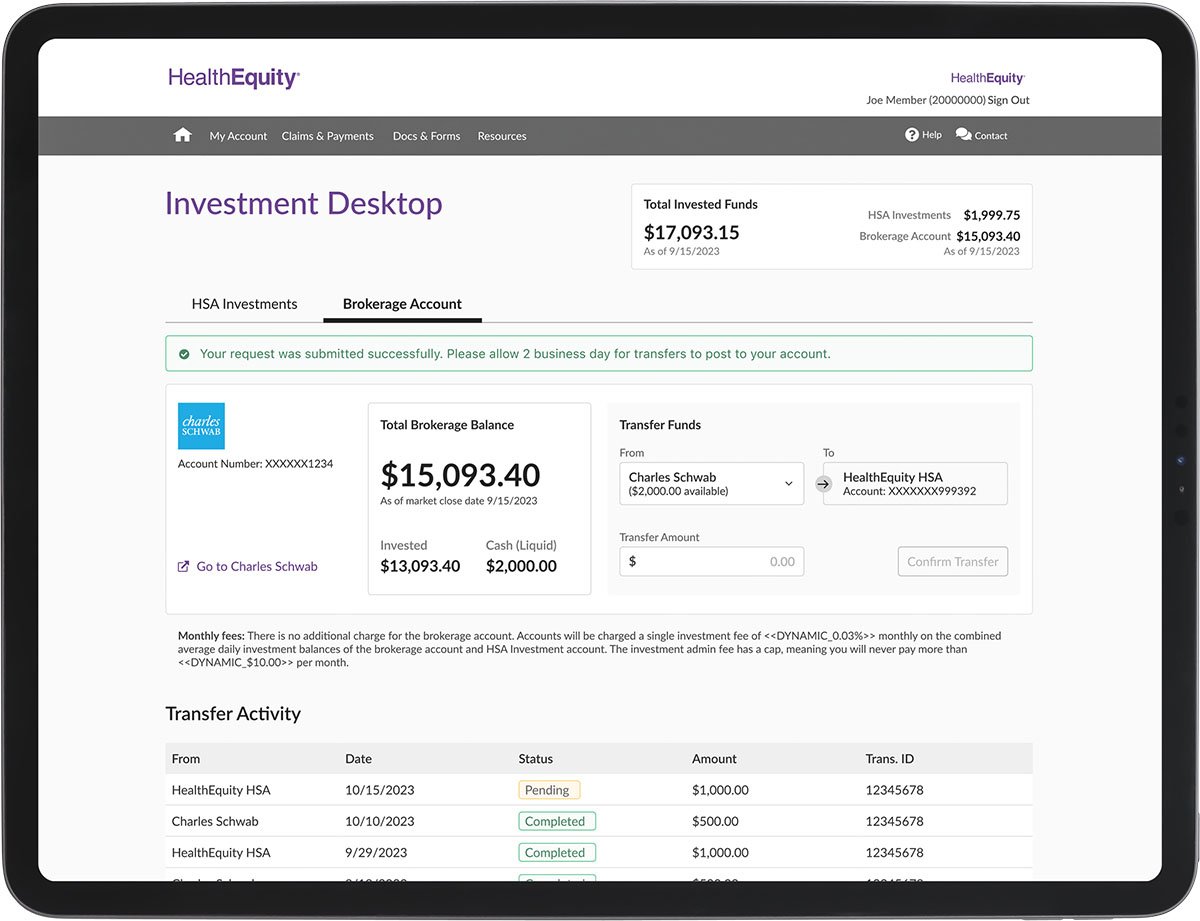
Provide access to brokerage investment details, balances, and activity without requiring separate logins or navigation
Streamline account management by enabling easy fund transfers and clear visibility into both core and brokerage investments
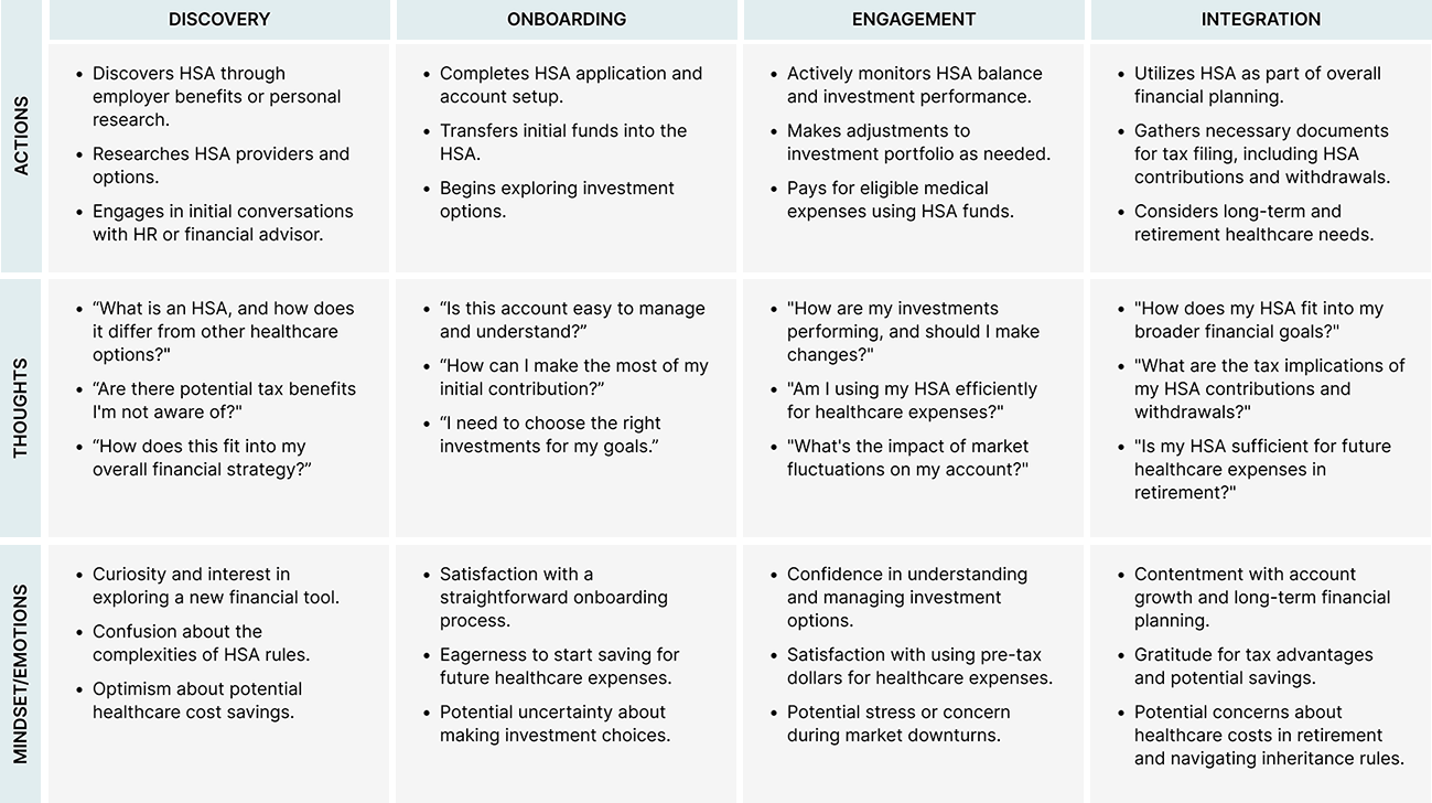
Discovery and Research
To ground the experience in real user needs, I researched and analyzed existing feedback and conducted interviews with HSA investors. I created an experience map that details common frustrations, decision points, and questions investors encounter while managing their portfolios.
The Client
HealthEquity Draper, UT
Sector
Healthcare Fintech
Role
Experience Map User Research User Flow UX/UI Design Personas Usability Test High-Fidelity Mockup Prototype Dev-Ready
Tools
Figma, Maze, Confluence, Jira
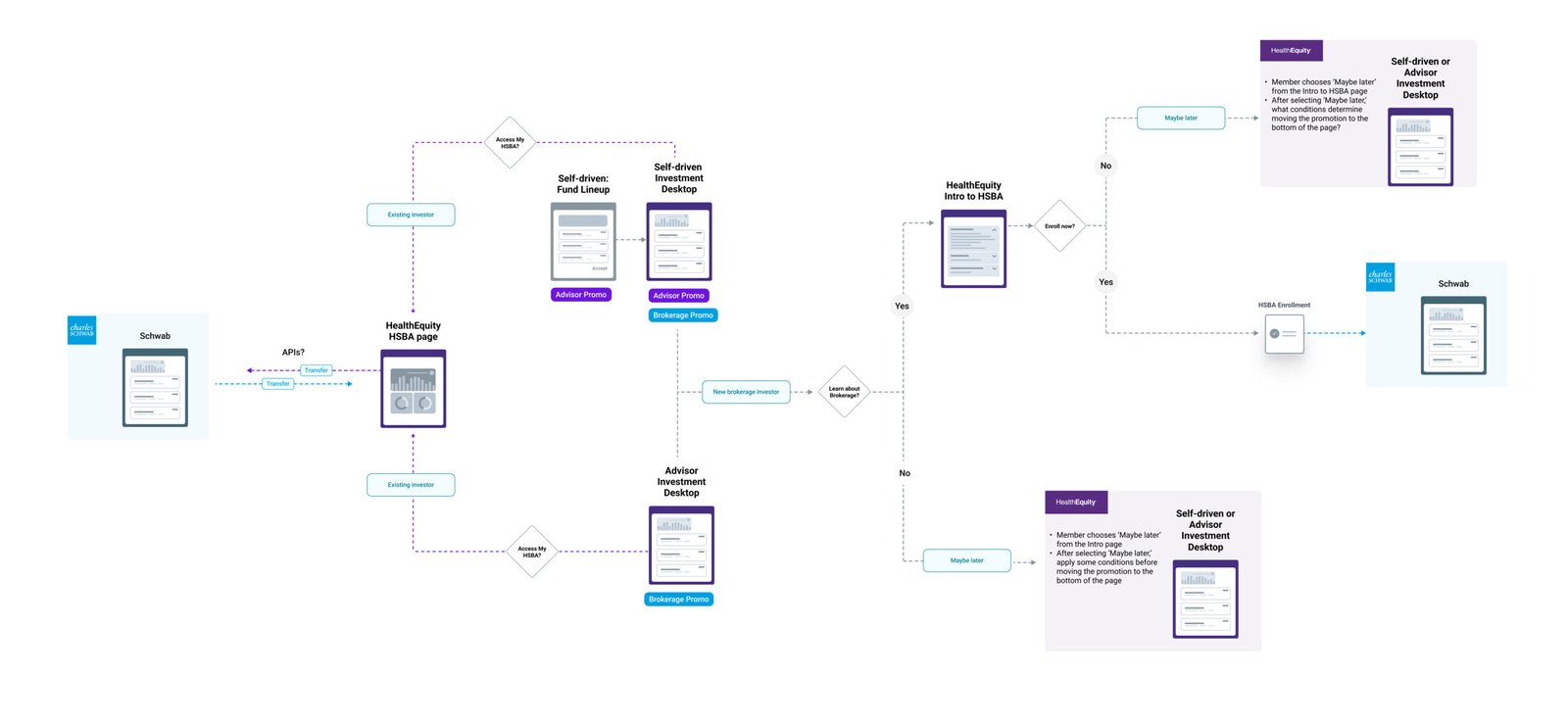
Define & Ideate
I designed a simplified user flow diagram that maps out the steps to discover, learn about, enroll in, and start using the brokerage account — all within the HealthEquity environment. The flow needed to work for both new and experienced investors while keeping their existing portfolio views.
Next, I sketched early ideas for the brokerage onboarding experience and included them in a clickable Figma prototype. These featured embedded tooltips, progressive disclosure of terms, and contextual “Learn More” links. I also added toggles and side-by-side account balances to help investors differentiate between core funds and brokerage assets.
Pre-testing mockups
Design Execution
I also led usability testing sessions with selected users, collecting direct feedback on comprehension, task flow, and interface clarity. Based on the results, I made critical changes: reducing jargon, clarifying brokerage-specific disclosures, and simplifying the fund transfer experience with direct affordances and inline help.
The implemented version struck a balance between discoverability and subtlety, earning praise from both product stakeholders and investors.
Impact and Reflection
While I left the organization shortly after making responsive screens “ready-for-dev” in Figma, this project remains a highlight in terms of strategic UX leadership and system-level thinking. The final design was approved for development and received strong internal support from stakeholders during handoff.
This is a demonstration of my ability to guide complex financial tools from insight to interface, grounding decisions in user research, collaboration, and thoughtful iteration.