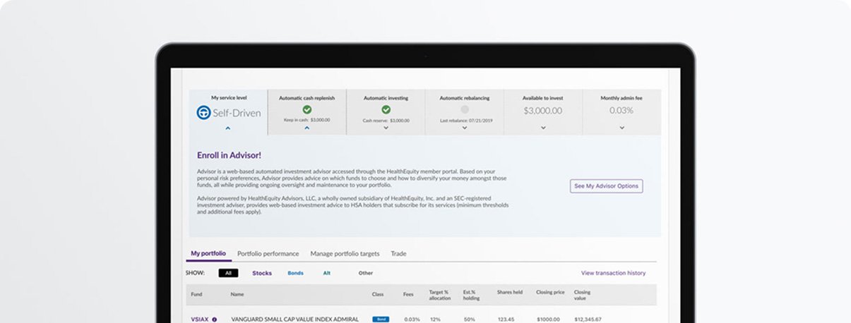
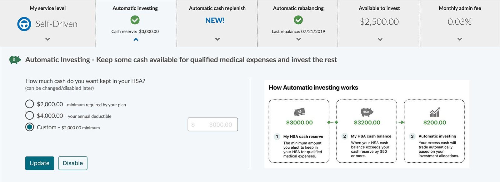
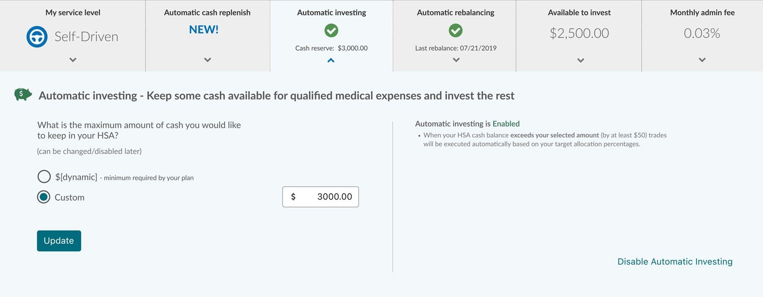
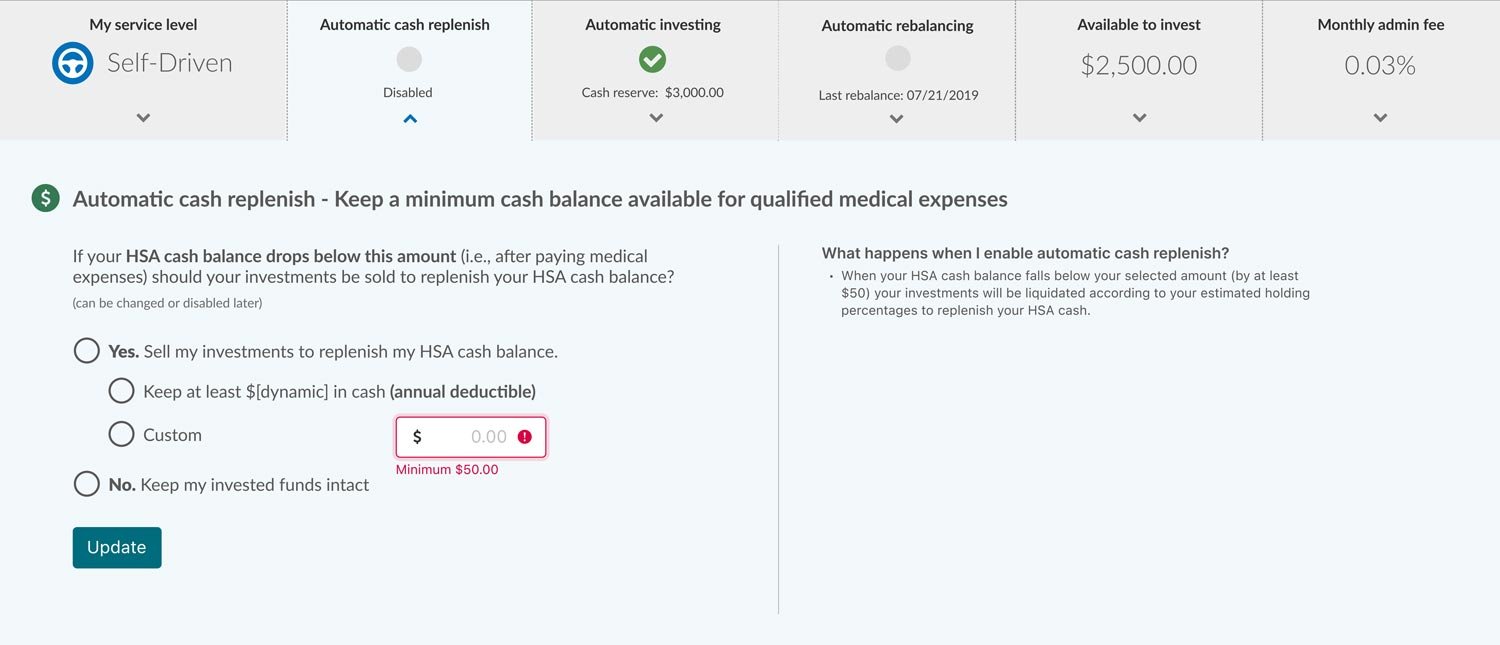
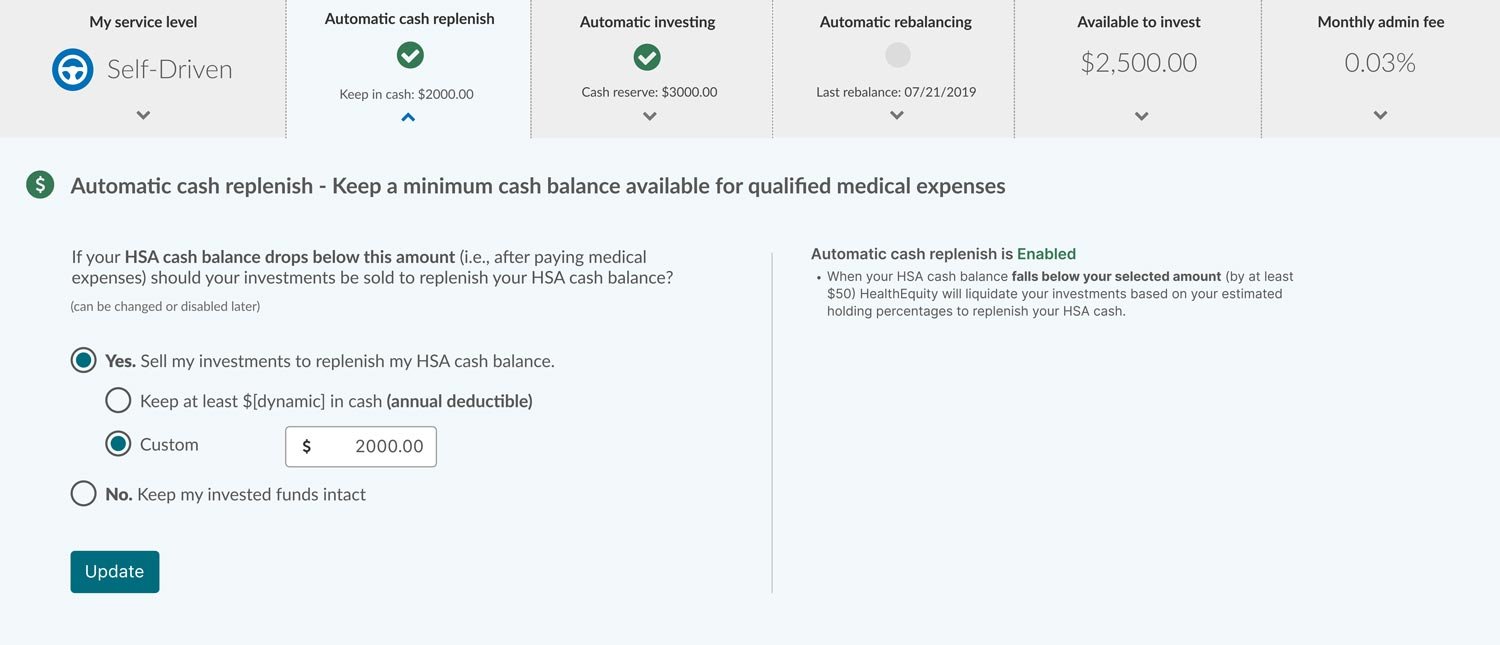
The HealthEquity Investment Dashboard offers HSA investors multiple ways to optimize their savings. To cater to Self-Driven investors, I helped develop a new feature: Automatic Cash Replenishment. This feature enables users to maintain a designated cash balance for medical expenses, while the remaining funds stay invested.
My goal was to create a simple, unobtrusive method for investors to set a cash threshold, automate transfers from investments, and ensure liquidity with minimal manual intervention.
The Challenge
Self-driven investors value complete control over their portfolios but often want to keep a cash buffer for upcoming health expenses.
Before this feature:
Users had to monitor and manually transfer funds to cash.
There was no way to automatically set a minimum cash threshold.
Support frequently received calls from users confused about managing their cash balances.
Discovery & Research
I partnered with our UX researcher to conduct:
Internal SME interviews with investment operations and support staff to identify patterns in user confusion.
User persona validation for Self-Driven investors to better understand their expectations around control and automation.
Key Findings:
Most users were unaware that their cash reserves could be depleted quickly due to automation settings.
Users wanted to “set it and forget it” — but with transparency and the ability to edit.
Competitor implementations were either too technical or buried in menu settings.
The Client
HealthEquity | Draper, UT
Sector
Healthcare FinTech
Role
Lead Product Designer
Team
Project Manager Senior UX Designer
Tools
Figma, Adobe CC
Define & Ideate
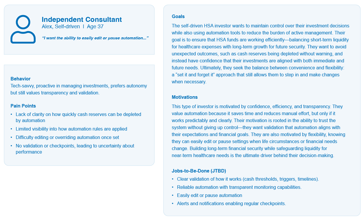
After refining the persona representing Self-Driven investors focused on manual asset allocation but needing a liquidity safety net I defined the problem and iterated on solutions that aligned with the existing UI patterns.
Core UX Problem: “How might we help self-directed investors maintain cash availability in their HSA without disrupting their investment strategy or adding friction?”
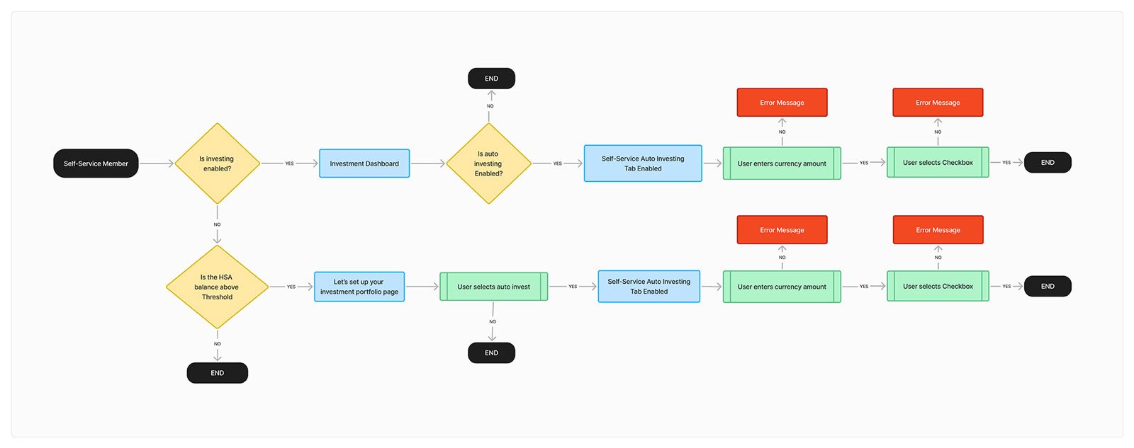
HSA Investor (Self-Driven) User Flow
The Self-Driven Investor
I explored several UI patterns, including:
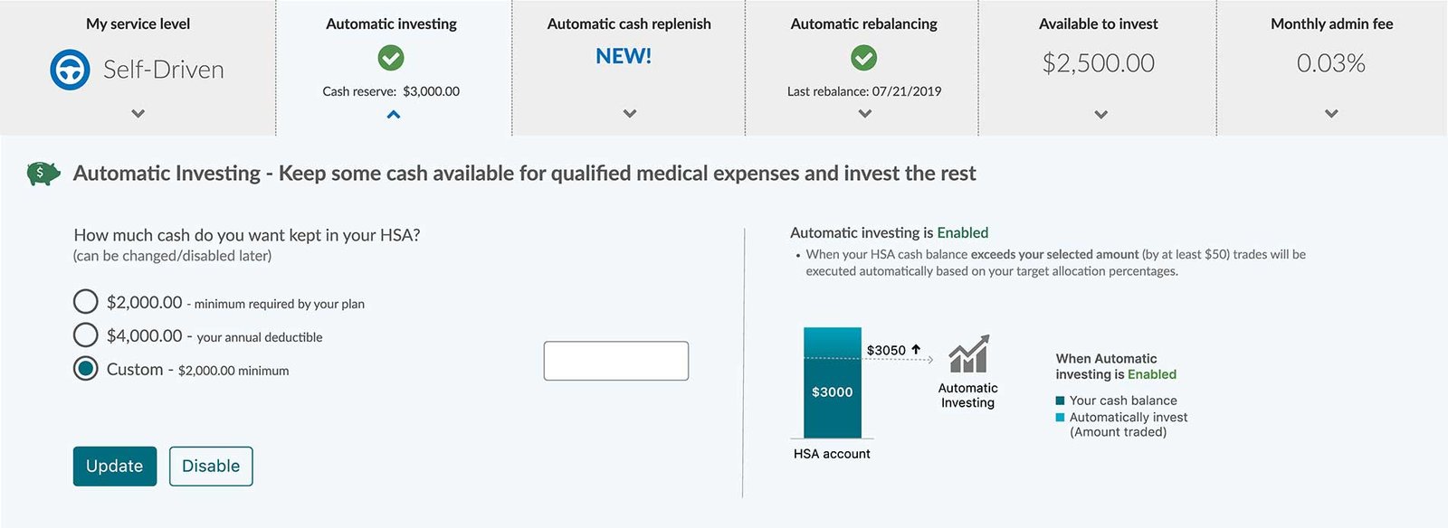
A toggle-enabled Auto Replenish card within the Investment Dashboard .
A modal flow to set the target amount with contextual help .
Tooltip explanations for new users, embedded within the dashboard.
A/B Testing I then explored two alternative infographic concepts to help users better understand “how it works.”
Option A: A simple bar chart display illustrating HSA cash balances and auto-investing . Option B: A multi-step modal within the dashboard.
The mockups were reviewed and evaluated; however, due to time constraints in development and evaluation, neither option was implemented.
A/B Test A
A/B Test B
Design Execution
Using Figma, I delivered high-fidelity designs and user flows, reflecting:
A modular dashboard card that visually aligns with other investment tiles
Created a simple toggle + amount entry field, with validation, confirmation, and edit options when enabled.
Ensured clear feedback messages during activation, deactivation, and account conditions (e.g., insufficient funds)
Collaborated with engineering and QA to ensure correct logic between dashboard UI and backend auto-transfer rules
No deductible
Auto-cash replenish has not been enabled.
Auto-Cash Replenish is Disabled
Auto-Cash Replenish is Enabled
Impact & Results
The Automatic Cash Replenish feature launched successfully to Self-Driven investors and received positive feedback from both users and internal teams. Support tickets related to low cash balances decreased, and users expressed greater confidence in managing their accounts. The modular design and component logic also established a pattern we’ve reused in future automation features across other investor segments.